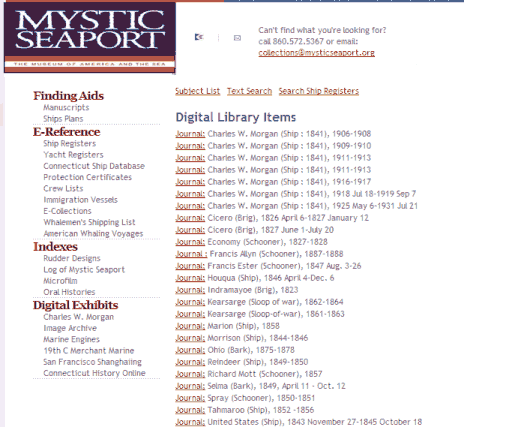
NavList:
A Community Devoted to the Preservation and Practice of Celestial Navigation and Other Methods of Traditional Wayfinding


From: Peter Fogg
Date: 2004 Oct 24, 13:33 +1000
(Chuck Taylor wrote:
Microsoft Excel is simply
another tool, like pencil and paper. Some people find it easier to make a
simple plot with a spreadsheet than with pencil and paper, and I think that is
what Peter and Jim were suggesting.)
Not me. I was pointing out
that the statistical approach, indeed averaging itself, works in the wrong
direction. What we want is an improved value, closer to the correct
time/altitude, which over a short period of time can be approximated as a
straight line. What the statistical approach, or averaging, does is take a
round of sights and produce from them a value that can only be a result of all
the data entered - good and bad. Not necessarily any better than any of the
sights taken.
The problem with this approach
is all values are given equal weight. The resulting slope is influenced by
outliers (extreme values). In any case, there doesn’t seem to be any
point in averaging once the slope is known. Think of a few data points that
approximate the right slope. What is not wanted is anything that takes the
chosen value away from there, as averaging might, depending on the data points
that don’t follow the slope.
I remember hearing a story
about a bridge that collapsed. It was due to some outlier being ignored when it
turned out to be vital (a statistician's favourite story!). Fair enough, but
our situation is different. Only one slope can be correct, the slope can't be
changed to accommodate an outlier. Either the extreme value is wrong, or the
others indicating a general trend are. Over a five minute period I can only get
about 4-6 sights. One value quite different to the others could throw the
result way off, if averaged.
There is an exception. Its
another virtue of this simple method. More than once, in practice, an outlier
happens to be either one minute in time, or one degree in altitude away from
the general trend. Concentrating so much on getting the seconds recorded
correctly its easy to ignore a new minute ticking over, or write down the wrong
degree while concentrating on the right fraction of a minute of altitude. When
this happens the 'bad' outlier can rejoin its 'good' brothers. Try doing that
with Excel, or the whirring wheel of a bubble sextant.
Looking at raw data its
difficult to see which sights are good or bad. The virtue of this simple pen
and paper approach is that it draws a picture that does just that. The chosen
result is subjective and intuitive, not the result of a mathematical process*,
and all the better for it. Consistently this 'line of best fit' approach
produces for me a better result than any of the actual sights could. It turns
poor data into a good sight.
(* Simple Linear Regression
can quite happily produce a line from a scatter of entirely random points. It
doesn't care - there does not have to be any trend for it to make clear. Even
when there is a trend the slope generated will be a function of all the data
points. I think that this is the Excel approach referred to.)