NavList:
A Community Devoted to the Preservation and Practice of Celestial Navigation and Other Methods of Traditional Wayfinding
Re:]Navlist 8479] Re: napier and logarithms
From: George Huxtable
Date: 2009 Jun 1, 10:32 +0100
From: George Huxtable
Date: 2009 Jun 1, 10:32 +0100
Thanks to Jim Wilson for his perceptive comments on the printing of
Oughtred's decimal notation from the 17th century. He seems to be nearly as
puzzled as me, though from a position of more background knowledge of
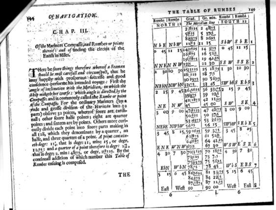
mechanical printing. I'll add that attachment showing Oughtred's page of
rhumbs, once again.

He wrote- "
Printed lines were achieved by using "rules," a thin (two point) typ height
strip which could be inserted between columns, for instance. But they
weren't bendable, breaking easily because they were type metal, mainly lead.
Now, I'm surprised at the vertical lines in your copy--if they were rules,
they would be straight, and they're not. That could be a consequence of
scanning. Significant distortion is evident throughout the page, and type
isn't at all moldable. But I can't explain the L shapes as distortion due to
scanning.

I scanned the page rather carelessly, so the whole page is very tilted in
the scanned frame. But the vertical column-boundary lines, printed on the
page, were just as wavy as they seem on the scan.

I wonder if a special version of those "rules", that Jim describes, might
have been made in various lengths, just for this purpose.  Could they have
been made with an overhanging extension, at one end, of a quarter-inch or so
of thin strip, to be rooted into the block only along the horizontal part?
Would that unsupported overhang, beacause of its thinness, then have then
been bendable through a right-angle, to make the vertical stroke of the L,
and to lie between two print characters. supported on the metal that
underlies them? (I'm lost, here, for the appropriate technical wording)

==============================

It's interesting how carelessly such pages were put together, in those days.
In the degrees corresponding to North by East, which should be 11.25, you
may notice that the "2" has been put in upside-down. Either nobody noticed,
in proof-reading, or else perhaps it was just too much effort to reset the
page.

If anyone can recommend a good technical book, about such early printing, I
would be interested to know about it.

I'll add a couple of pages, about Oughtred's thoughts on latitude and
(particularly) longitude, in another posting.

George.

contact George Huxtable, at  george@hux.me.uk
or at +44 1865 820222 (from UK, 01865 820222)
or at 1 Sandy Lane, Southmoor, Abingdon, Oxon OX13 5HX, UK.

| George:
|
| You asked:
|
| "I wondered how these marks had been put into my copy, and indeed,
| whether
| they had been laboriously drawn in, in manuscript, after printing. By a
| stroke of luck, the museum happened to have a second copy of that same
| edition. [It's hard enough to lay hands on a 17th century book, never
| mind
| finding two identical copies in the same place] And indeed, those L
| marks,
| in the two copies, were identical; they had indeed been printed.
|
| "So now, at long last, I get to my question. HOW were they printed? The
| museum librarian hazarded a guess that the printer had somehow inserted
| bits
| of bent wire into his block, to pick up the ink and transfer it. But how
| would they be held in place? Does anyone know enough about printing to
| make
| a guess?"
|
| As a journeyman printer in my youth, I'll venture my understanding.
|
| The size of the type is larger for the left digits, and smaller for the
| right. That would leave enough space for a rule to be inserted under the
| right hand type. But it couldn't be bent. And the rules take up space,
| and the spacing between numbers isn't greater where a vertical line is
| present. And they're all different, which I associate with hand-drawn
| lines. The idea of wires doesn't track, because printing is done with
| heavy pressure, so type has to be sturdy. The days of pages of individual
| type were a lot more difficult. Everything had to fit together and needed
| space. We didn't know better, so we just made it work.
|
| Lithography can be ruled out, since it wasn't invented until 1796, and
| besides, it was more suited to art than text and numbers then.
|
| Sorry, but my expertise ends here. And I was born three centuries too
| late to really understand.
|
| Jim Wilson
| ____________________________________________________________
| Free information - Learn about Email Marketing. Click now!
|

|
| |
|

--~--~---------~--~----~------------~-------~--~----~
Navigation List archive: www.fer3.com/arc
To post, email NavList@fer3.com
To , email NavList-@fer3.com
-~----------~----~----~----~------~----~------~--~---
