NavList:
A Community Devoted to the Preservation and Practice of Celestial Navigation and Other Methods of Traditional Wayfinding
From: Sean C
Date: 2017 Nov 26, 01:26 -0800
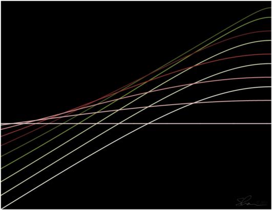
Just now I was messing around, trying to visualize the impact that changes in declination and local hour angle have on the altitudes of celestial bodies. My ultimate goal was to see how much a change of one or two arc minutes of LHA has on various declinations in order to better understand the role that small errors in these figures might impact sight reduction and LOP plots. So, I whipped up a quick graph as a starting point. Upon seeing the result, I thought it was a little too cluttered and confusing. I decided to re-color the series in a gradient to make them easier to pick out. But, the lighter lines were hard to see on the white background so I changed it to black. As soon as I changed the background I was struck by what a pleasing form appeared before me. Almost like a wave rolling over on itself as it breaks. I removed the gridlines, which I thought interfered with the flow.
Yes. Much better. I called for my wife (who has a degree in fine arts) and asked her what she thought of it. She liked it ... and jokingly acted miffed that I might now decide to be an "artiste". Don't get me wrong, it's no da Vinci, by any stretch of the imagination ... but I think it's nice to look at.* Which is kind of odd considering I don't generally like abstract or minimalist art. Indeed, I put the word "art" in quotation marks in the subject line of this post because I believe it is entirely subjective. I do, however, like the idea of art which is derived from science. More so when it is stumbled upon rather than forced, and even further when it actually conveys practical information. I feel it's akin to marveling at the beauty of our universe, whether or not it was intended to be beautiful ... it just is.
*Then again, I think meridian diagrams are nice to look at.
Anyway, enough of my rambling. The image is attached below. Please let me know what you think of it, and feel free to save and display it ... if you think it's at all worthy of that. If anyone should happen to ask for the name of the "artist", it's Shawn Cook. :)
Thanks!
Sean C.
PS
There's a bit of an optical illusion going on here, as well. The very light pink line which is highest on the left side of the image and lowest on the right side appears to slope slightly downward. It is, however, perfectly horizontal across the entire image. It's essentially a plot of Polaris' altitude at my latitude (if Polaris was exactly at 90° N).


